
The only thing I would recommend visually. This might just be my 2 cents is to make the outlines around the buttons a bit darker. The pale look makes some buttons look off on the page. It also doesn't match the tone/color scheme of the site, which features a dark shade of blue.
I would also put the *just edited by* part below the description, it feels better than at the bottom.
I also feel the reviews might take up a bit of space. Granted, I think I might just not be used to it. Letterboxd uses a similar layout for reviews and I like it. Maybe limit the ratings/reviews to 3 on the Overview Page and keep the full list on the ratings/review page? It might help. I would ask others though, since that's just my opinion.
Personally, I might still use the old version for a while since I feel like some things are less intuitive on the new version.
New Title Information Page - Sponsor Testing
-
JonSmith

- Posts: 92
- 153 Ratings
- Your TCI: na
- Joined: Wed May 22, 2019 4:20 am
-
JonSmith
- Posts: 92
- 153 Ratings
- Your TCI: na
- Joined: Wed May 22, 2019 4:20 am
Re: New Title Information Page - Sponsor Testing
I agree. I would limit parts of each section on the Overview. 3 Reviews. 2 Collections. 1 Row of Similar titles, etc. Probably even leave Statistics on it's own page. That would eliminate some clutter imo. The current design shows too much of each section I think. It would better if it was somewhat more compact I think.
If possible also keep the legacy design so some people can toggle it off.
P.S. Similar Titles is probably the best part of the new design
-
Dorkovsky

- Posts: 339
- 836 Ratings
- Your TCI: na
- Joined: Sat Apr 22, 2006 3:15 am
Re: New Title Information Page - Sponsor Testing
100% agree about the shape of the box between PSI and rated. this is currently my greatest grievance

Re: New Title Information Page - Sponsor Testing
Thank you all for this great feedback!
As mentioned by a few of you, I want to emphasize that this is definitely still not the fully-finished product, and that we're actively working on suggestions and bugs that folks have been submitting via the Bugs Submission form. Throughout the design phase, we could only guess at how certain aspects of the revamp would be received... so it's incredibly useful to learn what you like and what you don't.
At the end of the day, no big change is ever going to fully appeal to everyone... and that's especially true when a site has as much history as ours. For a long time, the biggest complaints we've gotten about Criticker is that it's dated; it's ugly; it looks like it's from 2010; it needs a functional mobile version; it discourages new users from joining; etc. And when we did a survey a few months back, this is also what most of our existing users said.
We have ambitions for Criticker, and know it has a ton of potential. Although it will be difficult, we truly believe we'll be able to preserve the things which make the site unique, while also enabling growth. And we're going to be depending on you to keep us on that track.
As this testing period continues, we will try our hardest to address the biggest points of contention with the new design. And we'll keep you all up-to-date as we do!
-
lineuphere

- Posts: 10
- 0 Ratings
- Your TCI: na
- Joined: Mon Jun 27, 2011 4:54 am
Re: New Title Information Page - Sponsor Testing
At 1:45 in the preview video you mention "full-screen width." Is that indeed an upcoming feature? It's tough to judge the updated layout right now because it's still confined to the same width as the old side. My first response it, oh, the fonts are bigger and there's some rounded shapes, but now my carpal tunnel is flaring up from all this scrolling I never had to do before.
One quick thing:
The Overview page left aligns the Title but the internal tabs center the title. This appears aesthetically inconsistent to me. It's apparent on longer-titled films, like this:
https://www.criticker.com/film/The-Search-for-Signs-of/ vs. https://www.criticker.com/film/The-Sear ... f/ratings/
I dig a lot of the new features; love that top 100 TCI graph. And add to the collections button is sharp. Hooray for the run time!
-
JonSmith
- Posts: 92
- 153 Ratings
- Your TCI: na
- Joined: Wed May 22, 2019 4:20 am
Re: New Title Information Page - Sponsor Testing
Just a quick note on my compact comment. I think Cast and Crew might be the best example. It takes up so much space.
I agree some of the new features are great. I personally, just think the design can be refined a bit. I think some of it might be fixed if the width of the website gets bigger. Idk how it looks on some screens, but Criticker doesn't use the full width of my monitor.I dig a lot of the new features; love that top 100 TCI graph. And add to the collections button is sharp. Hooray for the run time!
-
Ramy

- Posts: 92
- 170 Ratings
- Your TCI: na
- Joined: Sat Aug 08, 2015 5:46 pm
Re: New Title Information Page - Sponsor Testing
The main thing for me is that it's all too big and spaced out, especially the ratings section. I'd make it smaller and have it back in a box on the right of the page like before. It was perfect that way. No need to change it.
The Cast & Info section doesn't need its own page. It was nice to have it all in the overview.
Love the language and runtime additions.
At the bottom of the page, I like the similar titles suggestions, collections, etc., but I'd make it so you don't have to scroll down much. It's just unpleasant.
So I'd condense everything majorly, while keeping the modern look.
Re: New Title Information Page - Sponsor Testing
Just wanted to keep you all informed of the changes we’re making to the new Title Information Page, based on your feedback and bug reports! Here are a few we’ve recently fixed up:
JustWatch on Subpages
The JustWatch box was never loading any results on the subpages (Ratings, Collections, etc). Now it is!
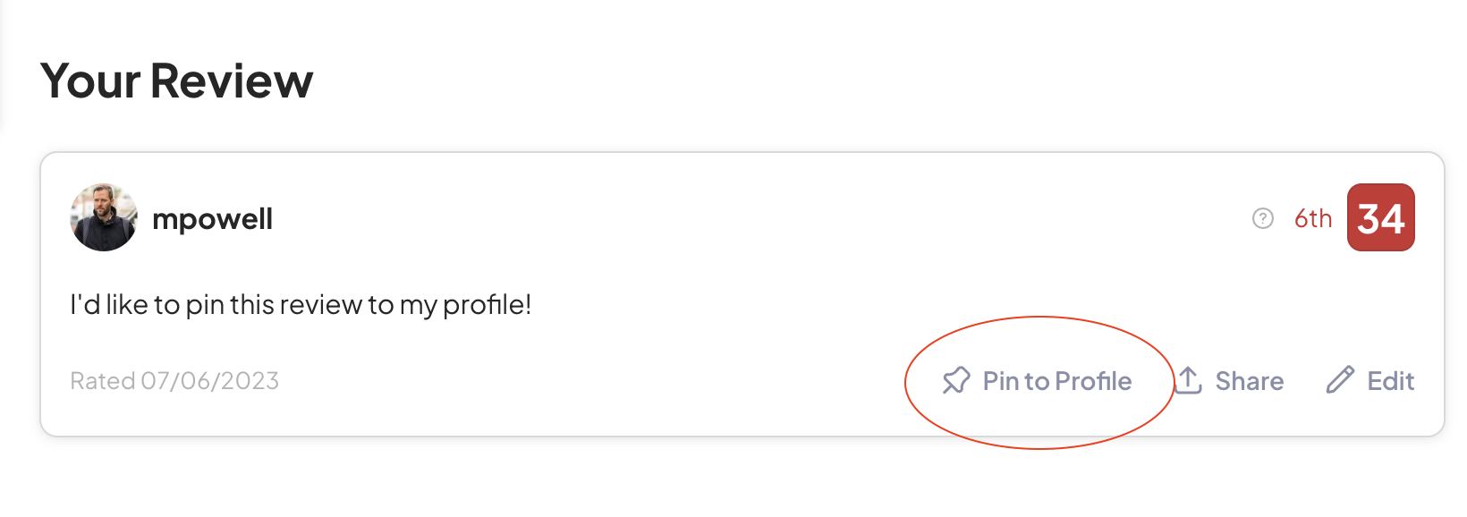
Pinning to profile
Yikes, we had forgotten the ability to feature a review on your profile page! After promising up-and-down that no functionality had been removed. This was an oversight -- big thanks to KasperL for pointing it out!
Errors when accessing new subpages while on old version
If you switched the old version, but were on one of the subpages, it resulted in an error. That's no longer the case.
Jumping down to shared review
If you were sharing someone's review, it didn't automatically jump to the right spot on the screen. Now it does
Force wrapping on long screens in collection cards
This is all in addition to a bunch of functionality that we've changed behind the scenes, which isn't necessarily visible from the front end. If you're not a sponsor, and would like the chance to help us shape the future of Criticker, please consider signing up!
JustWatch on Subpages
The JustWatch box was never loading any results on the subpages (Ratings, Collections, etc). Now it is!
Pinning to profile
Yikes, we had forgotten the ability to feature a review on your profile page! After promising up-and-down that no functionality had been removed. This was an oversight -- big thanks to KasperL for pointing it out!
Errors when accessing new subpages while on old version
If you switched the old version, but were on one of the subpages, it resulted in an error. That's no longer the case.
Jumping down to shared review
If you were sharing someone's review, it didn't automatically jump to the right spot on the screen. Now it does
Force wrapping on long screens in collection cards
This is all in addition to a bunch of functionality that we've changed behind the scenes, which isn't necessarily visible from the front end. If you're not a sponsor, and would like the chance to help us shape the future of Criticker, please consider signing up!

Re: New Title Information Page - Sponsor Testing
At the moment the new film page isn’t remembering the user’s preferences for ordering ratings and reviews like the old page did, should be a simple fix.
Overall it seems like functionality is down - it was really great being able to easily scroll through dozens of reviews on a film’s page without having to do any clicking to load up more - seeing only ten on the updated page is definitely too few in my opinion. Reviews are the main attraction for me on the site.
For the record, I love the “dated” 2010 look - too many sites keep updating away from that and becoming so much more annoying to use - IMDb case in point.
-
djross

- Posts: 1214
- 10 Ratings
- Your TCI: na
- Joined: Sun Apr 16, 2006 12:56 am
Re: New Title Information Page - Sponsor Testing
Just to add a bit more about this point in particular: I'd say that only listing one director in that top part is more of a problem than I originally indicated. One starts to learn that it's misleading, because one assumes that there's one director, and then later realises one has been fooled by the fact that there's only one name at the top. But the eventual consequence is that one learns that actually looking at that top line doesn't convey meaningful information about how many directors a film has, and so one then feels compelled each time to scroll down to the bottom or click to Cast & Info in order to find out if it is true or not true that there is only one director. So for that reason, I really recommend not leaving it as it is, with just one director indicated at the top of the page.djross wrote: ↑Sun Jun 04, 2023 2:25 am6. Near the top of the Overview page, there is some initial cast and crew information, but it only includes one director: why not give the same amount of space for directors as for actors, that is, one line’s worth of space, so that a film with, say, two directors can have both listed at the top of the page? And why not a line for writers too?