A Full-Width Layout for Criticker, and More!

This is where you'll find information about updates to the site -- new features we've introduced, bugs we've fixed, and anything else which might be of interest to the community!
bof
Posts: 10
0 Ratings
Your TCI: na
Joined: Tue Nov 15, 2011 3:37 pm

Re: A Full-Width Layout for Criticker, and More!

Post by bof »

DecanusEllis wrote:
Tue Mar 05, 2024 11:17 pm
My eyes and assumedly most people's eyes are not comfortable with the information being shown to them from all edges of the screen. It's so weirdly taxing to be looking to the left for something, and then darting your vision all the way to the right for another thing.

Even Letterboxd has most of its content centred with significant gaps to the left and right, and the same goes for a lot of IMDb's page formatting. I honestly cannot think of many websites where stuff is spread out the way it is in this new update.

There's no real need for much of the content to be spread across the entire page, it just makes browsing the website an unnecessarily arduous task.
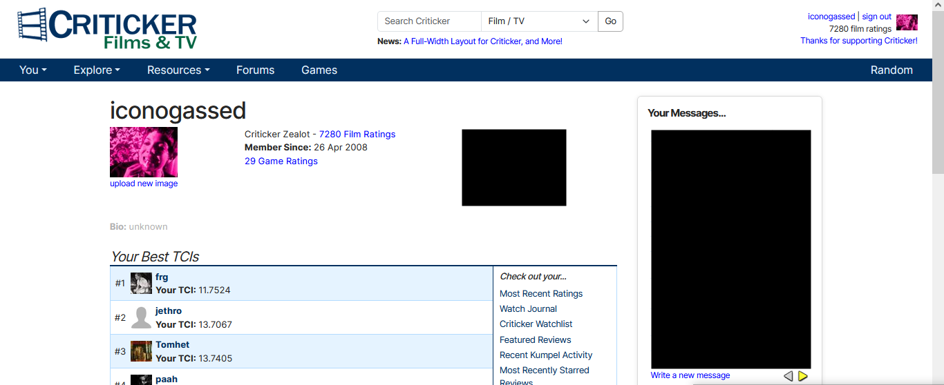
Yeah, this. And the fact that they emphasize this as a feature - in the heading of this post, even - makes me think the odds of them actually addressing it are next to nil. Once you've launched the Titanic with "Now extra fast sinking!" you're not going to go back on it.

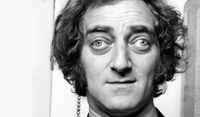
And as much as I love Marty Feldman, I don't really want to have to imitate him to keep browsing a site that was already losing out to its main competitor.
Image

mpowell
Posts: 3897
1 Ratings
Your TCI: na
Joined: Fri Sep 09, 2005 10:22 am

Re: A Full-Width Layout for Criticker, and More!

Post by mpowell »

Victoriouz wrote:
Mon Mar 04, 2024 8:08 pm

Also to bring this back on topic, I second BadCosmonaut
BadCosmonaut wrote:
Mon Mar 04, 2024 2:56 pm
One annoying thing for me is on a movie page where it lists all the actors in their little actor bubbles, I want to be able to middle mouse click those kinds of bubbles to open a new tab of that link. I used to be able to middle mouse click names and such and it would load a new page for that person or whatever. Now, middle mouse click doesn't work, and I have to left mouse click and load the current page into the new page.
pressing Ctrl + clicking the link won't open it on a new tab, same if we try Tab, Ctrl+Enter, and that's the one thing I actively dislike about the new layout 2.0
This should now work as you would expect -- you can "ctrl+click" (or middle-mouse click) any of the cast member names, to open them in a new tab. The same is true for the "tabs" (Collections / Stats / Similar / Trailer).

Thanks again both of you for pointing this out! I do think this was one of the usability things which had been a definite downgrade on this new version, but it should now work as you would expect :)

(We haven't yet done the links in the various Pagination spots, as it's a little different, but do have a bug filed for it).

dardan
Posts: 313
57 Ratings
Your TCI: na
Joined: Sun May 03, 2015 9:08 pm

Re: A Full-Width Layout for Criticker, and More!

Post by dardan »

Nice!

The changes look appealing to the eye. Hopefully new users will feel more easily at home in this environment, enabling for this website to continue.

Victoriouz
Posts: 162
23 Ratings
Your TCI: na
Joined: Fri Sep 18, 2015 11:43 pm

Re: A Full-Width Layout for Criticker, and More!

Post by Victoriouz »

mpowell wrote:
Wed Mar 06, 2024 12:26 pm
Victoriouz wrote:
Mon Mar 04, 2024 8:08 pm

Also to bring this back on topic, I second BadCosmonaut
BadCosmonaut wrote:
Mon Mar 04, 2024 2:56 pm
One annoying thing for me is on a movie page where it lists all the actors in their little actor bubbles, I want to be able to middle mouse click those kinds of bubbles to open a new tab of that link. I used to be able to middle mouse click names and such and it would load a new page for that person or whatever. Now, middle mouse click doesn't work, and I have to left mouse click and load the current page into the new page.
pressing Ctrl + clicking the link won't open it on a new tab, same if we try Tab, Ctrl+Enter, and that's the one thing I actively dislike about the new layout 2.0
This should now work as you would expect -- you can "ctrl+click" (or middle-mouse click) any of the cast member names, to open them in a new tab. The same is true for the "tabs" (Collections / Stats / Similar / Trailer).

Thanks again both of you for pointing this out! I do think this was one of the usability things which had been a definite downgrade on this new version, but it should now work as you would expect :)

(We haven't yet done the links in the various Pagination spots, as it's a little different, but do have a bug filed for it).
thank you!

djross
Posts: 1214
10 Ratings
Your TCI: na
Joined: Sun Apr 16, 2006 12:56 am

Re: A Full-Width Layout for Criticker, and More!

Post by djross »

1. Yes, the three columns of the film database page are now laid out correctly.

2. Yes, the font and layout issues on the forum page are now solved too.

3. The search box on the collections page is now working.

4. Thank you for adding the feature about remembering the "more" setting on the film title page.

BUT: I do have to add that it is a bit strange indeed that, when the setting is on "more", and I am using Desktop, my own review of a film is not visible or barely visible on the film title page (depending on font size), and I have to scroll down a bit to read it. I think almost everyone would think that it is more natural and obvious that one's own review should be immediately visible on a film title page. And even when the setting is on "less", usually there is only the very top of one's own review visible. For users who just give scores, it's not an issue, but I do really think this is a weakness of the layout that many users who do write reviews will find frustrating.

My own strong suggestion would be: one's own review should be located below the title of the film and above the description of the plot.
Last edited by djross on Wed Mar 06, 2024 4:17 pm, edited 3 times in total.

iconogassed
Posts: 920
29 Ratings
Your TCI: na
Joined: Sat Apr 26, 2008 4:41 pm

Re: A Full-Width Layout for Criticker, and More!

Post by iconogassed »

DecanusEllis wrote:
Tue Mar 05, 2024 11:17 pm
I understand the logic of this layout update, but I find its implementation quite ineffective.

My eyes and assumedly most people's eyes are not comfortable with the information being shown to them from all edges of the screen. It's so weirdly taxing to be looking to the left for something, and then darting your vision all the way to the right for another thing.

Even Letterboxd has most of its content centred with significant gaps to the left and right, and the same goes for a lot of IMDb's page formatting. I honestly cannot think of many websites where stuff is spread out the way it is in this new update.

There's no real need for much of the content to be spread across the entire page, it just makes browsing the website an unnecessarily arduous task.
Yep.

The empty space is awkward, overwhelmingly so...the layout looks distorted and the individual components marooned. And the distortion is not simply from comparison to the previous design. Inasmuch as I can adopt the perspective of a new visitor, the use of space here seems obviously puzzling:

Image

The "datedness" the admins are concerned about seems to me to have far less to do with the width of the page than simply the actual look of the logo, menus, etc. I don't know why the old design would be stretched to full width rather than a new full-width design implemented. I mean, I know why. Obviously the team and resources are limited, but the cure here is worse than the disease. The update looks far more awkward on a desktop than the old design.

And collection/database/rating pages...I can't see the reason for so much more spacing in/between entries, thus more scrolling for less information. There is a serious impediment to my enjoyment of the site.

And I remain confused that anyone could think the Criticker experience is enhanced by inscrutable pictures of filmmakers. Tiny circles with a diameter of, what, 20 pixels?

Image

How many of those pictures of members of a fairly prominent cast do you think the average user would be able to identify? And if the user doesn't know what Chris Pratt looks like, how will that picture enhance their experience? And if they do know what Chris Pratt looks like?
Last edited by iconogassed on Wed Mar 06, 2024 5:12 pm, edited 1 time in total.

Skavau
Posts: 91
0 Ratings
Your TCI: na
Joined: Sun May 22, 2022 6:26 pm

Re: A Full-Width Layout for Criticker, and More!

Post by Skavau »

The little pictures of the filmmakers, actors etc, showed up before the redesign. That's unrelated to it.

iconogassed
Posts: 920
29 Ratings
Your TCI: na
Joined: Sat Apr 26, 2008 4:41 pm

Re: A Full-Width Layout for Criticker, and More!

Post by iconogassed »

Skavau wrote:
Wed Mar 06, 2024 3:46 pm
The little pictures of the filmmakers, actors etc, showed up before the redesign. That's unrelated to it.
They are not new with the brand new full-width stuff. They were new as part of the actual re-design that was implemented last year. This is why I said “I remain…”. I am whining about it anew because it makes zero sense and a big part of the problem of poor use of space and hey it might still be changed.
Last edited by iconogassed on Wed Mar 06, 2024 5:15 pm, edited 1 time in total.

brell
Posts: 11
Ratings
Your TCI: na
Joined: Sat Nov 07, 2020 3:51 am

Re: A Full-Width Layout for Criticker, and More!

Post by brell »

I'm pretty content with this update--very glad you've addressed all the concerns I had with the title page since the initial roll-out!

However, please please please add back the ability to add movies to watchlist/easily see if they're added to watchlist from search pages and from the new release page. I frequently add anything coming out that I want to keep tabs on to my watchlist, but can't always remember if I've already done it. It was convenient to already be able to see 'saved' right under the movie rather than having to click into it again. I really hope you add this functionality back and would absolutely miss it if it stays gone! I notice it's still on the homepage but only for the very first film shown.

jnydam
Posts: 3
0 Ratings
Your TCI: na
Joined: Wed Dec 18, 2013 5:33 am

Re: A Full-Width Layout for Criticker, and More!

Post by jnydam »

When I click on "All Your Ratings," it appears to me that my ratings are the old numbers I assigned films. These were not percentiles. A rating of 80 very well may have been in the 90th percentile by my method- I was adapting to how the site created tiers for me. However, now when I rated a new film a 67 it listed it as my percentile. Supposed I had 100 films rated and my 50th highest rated film was rated a 61. Are the new ratings lying to me stating that this film is 61st percentile? If all users don't recalibrate their ratings doesn't this make the TCI and PSI models useless?

Thanks!

Locked