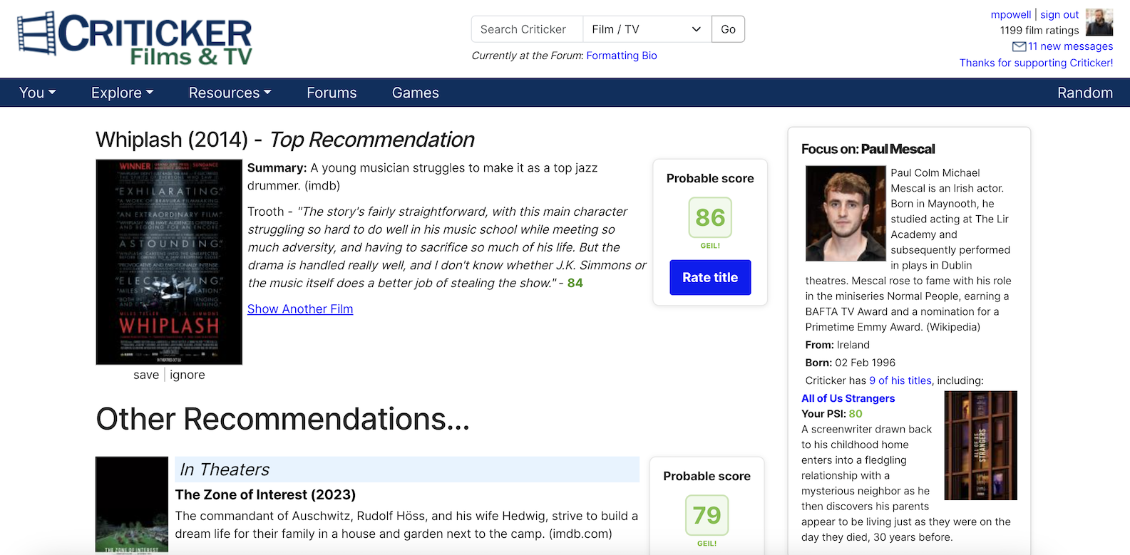
We're excited to announce that some big changes are coming to Criticker, on March 4th. And when we say "big", we mean wiiiiiide.
Full-Width Criticker
One of the longest-standing complaints about Criticker has been its cramped layout. And... yeah. We can't really defend ourselves. It's something that we should have changed years ago. And very soon, we will!

Increasing the screen width gives us a lot more space to play with, and allows Criticker's content room to breathe. You'll notice subtle changes all over the site, such as elements having a bit more width or a little more spacing.
This was a major change which required updates to just about every single page. But we couldn't stop there!
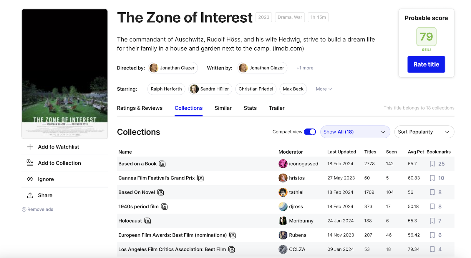
Title Information Page - (Version 2.0?)
When we launched the new version of the Title Information page back in July of 2023, it was met with universal praise, and not a single iota of criticism!! (This is our site, we can rewrite history however we want).
Alright, fine: there were actually a lot of very valid complaints about the new page. Although it was a step in the right direction, with modern components and better aesthetics, there were some definite issues and the community let us know about them.
We've heard the feedback, and are really excited about our next iteration on this page. We've removed the need to click around to multiple sub-pages to get the information you're looking for, and introduced an infinite scroll for reviews, so that you never have to "page over". There's a new searchbox, so you can find a particular user's rating, or a particular phrase in a review. There are awesome new compact views for both the ratings and collections lists. And there are a ton of little stylistic enhancements, such as to the filter buttons and actions.

Cohesion, and an Eye Towards the Future
For most of its history, Criticker has been designed by me, Mike [waves at crowd]. The only problem is, I'm not a designer. Of course, I didn't want the website to look outdated and ugly, it's just I don't really have an innate sense of style. It's the same in real life -- nobody has ever watched me walk down the street and thought, "Now there goes a fashionable man who understands what looks good."
Anyway, Criticker was designed with my own (ahem) personal flair. Over the years, I've thrown components onto the site without checking how other, similar components looked. I've defined colors and padding on an ad-hoc basis, instead of as part of a comprehensive system. 8px here, 1.5em there, whatever, etc. It's just how my brain works.
But with a lot of help, Criticker is finally growing up. We're building a design system for the site, with defined colors and styles, and putting together a library of solid, reusable components. We're still an exceedingly small team for a website which has grown rather large, but things are starting to click. You might start to notice things like the colors being cohesive across the site, and components reappearing on various pages.
The launch of the Title Information page in July of 2023 was Phase 1 for the future of Criticker. The upcoming launch of the full-width version of the site, along with the iteration on our Title Information page is Phase 2. And we have a lot more phases to come -- Collections, Branding, and Profiles are all on our radar.
Twilight for Tiers and the Legacy Title Info Page
As part of our growth, we also have to abandon some things that no longer fit. So, along with the introduction of full-width Criticker, March 4th will also see the sunset of the legacy Title Information page, as well as Tiers.
Newer users might not be familiar with either, but long time users probably are. Criticker began life with Tiers. We split ratings up into ten "tiers", so that a really great film was in "Tier 10" and a poor one in "Tier 1". Although it was many years ago that we introduced the more granular and accurate Percentiles, we've always left Tiers in place. But maintaining two systems of calculations has become untenable, and so Tiers are on their way out.
The same is true of the legacy Title Information Page -- maintaining different versions of the same page is something we're not going to be able to do in the long run. So, the new Title Information page being introduced on March 4th will be the only Title Information page.
Although only a small percentage of users will be affected by these changes, we're aware that they're among our most long-term and loyal users. As ever, we're happy to listen to any concerns or feedback you might have -- either before or after the big launch. Just send an email to info@criticker.com or leave a comment in the forums!
We really hope that you like the new updates! As we redesign Criticker, our main goal is to attract and retain more users, and really start growing. A larger member base will lead naturally to better TCIs, which in turn should result in more accurate recommendations for everyone. We're really excited about the positive direction in which Criticker is heading, as well as for the many other changes yet to come, and hope that you are as well!